Considering using Elementor on your site? In our hands-on Elementor review, we’ll give you a detailed look at this popular WordPress page builder and whether it’s right for you.
Since its launch in 2016, Elementor has quickly gone on to become one of the premier WordPress page builder plugins, active on over 2 million WordPress sites according to WordPress.org.
To give you a good look at this tool, we’ll divide our Elementor review into two sections. You’ll get a detailed look at:
- The core functionality in the free version that’s available at WordPress.org. Without spending a penny, the free version already lets you do some pretty cool things.
- Elementor Pro. With the paid version, you can build popups, add forms, and design your entire theme using the same drag-and-drop Elementor interface from the free version. Yeah, it’s pretty powerful…
If you’ve already played around with the free version at WordPress.org, you can jump straight to our Elementor Pro review. Otherwise, keep reading to start with a look at the free core version at WordPress.org…
Elementor Review – at a glance
Elementor Page Builder Review
-
Ease of use
-
Speed
-
Code Quality
-
WordPress Compatibility
-
Support & Documentation
Summary
This is by far our favourite WordPress Page Builder in 2019. The thing we like most about Elementor right now is the team behind the plugin. While there are now dozens of WordPress page builders to choose from, the team behind Elementor have been rapidly enhancing the plugin to be superior to any other Page Builder in just about every way possible.
What Do I Like About Elementor?
I’ll talk about what I like below. But let me start with what I love:
NO SHORTCODES. Scream it with me. Yell it from the rooftops.
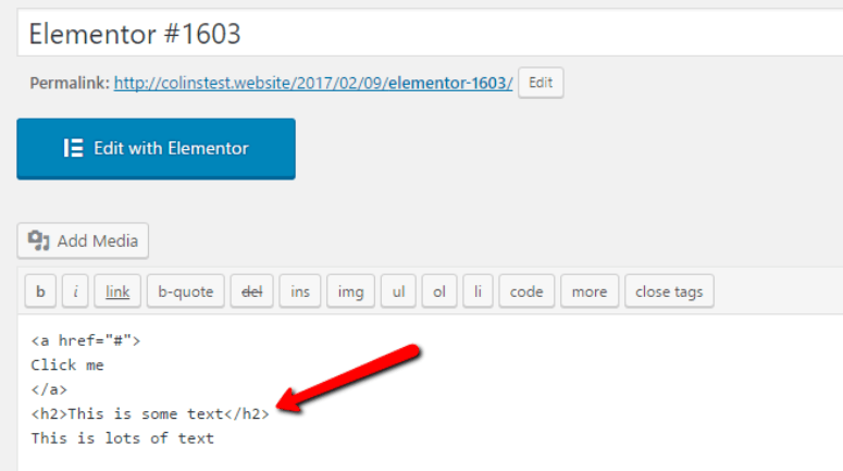
If you ever decide to stop using Elementor, it leaves clean code in your WordPress Editor. There’s absolutely no shortcode lock-in like you’d experience with page builders like Visual Composer or Divi.
For example, after building a simple page with a button and some text, this is all Elementor leaves behind:
But I don’t want to make it seem like being able to get away from Elementor is the only good part. It’s also got:
- A great front-end visual editor
- A solid element list, even in the free version (and better ones in the Pro version)
- Tons of premade layouts in both the free and Pro version
- Detailed control over styling and positioning for each element
- The ability to create dedicated landing pages (with a free third-party plugin)
- And lots, lots more.
Hands-on Elementor Review
Ok, enough with the jibber-jabber. Let’s actually dig into the Elementor page builder. When you install and activate it, you’ll get this handy new button on all of your posts and pages:
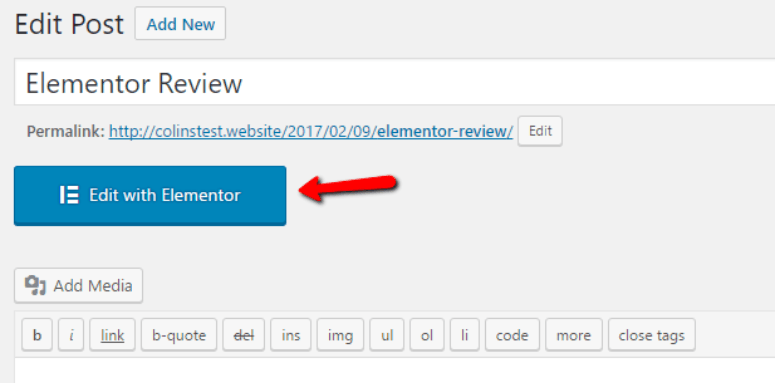
To start editing with Elementor, all you need to do is give it a click.
Then, you’ll find yourself in the Elementor interface:
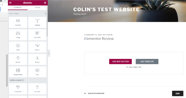
As I said, Elementor is a front-end visual builder. So while you’re building your page, you’ll see the final product exactly like your readers will.
To get started, you can either build your page from scratch or use a template.
Building a Page from Scratch with Elementor
Elementor’s interface is a breeze to use. Not only is it smooth and glitch-free, it also lets you go in-depth into how you position your elements.
To get started, you first need to add a Section. Think of a section as a container, while Elements are the actual content that fits inside that container. You can set up different default column widths, though you can always resize these later:
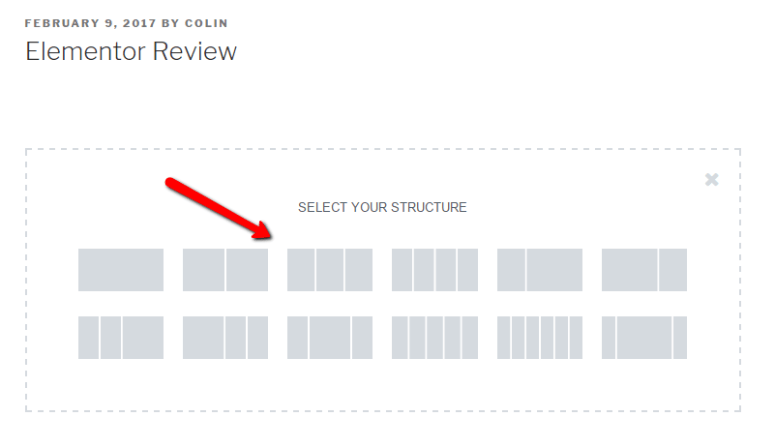
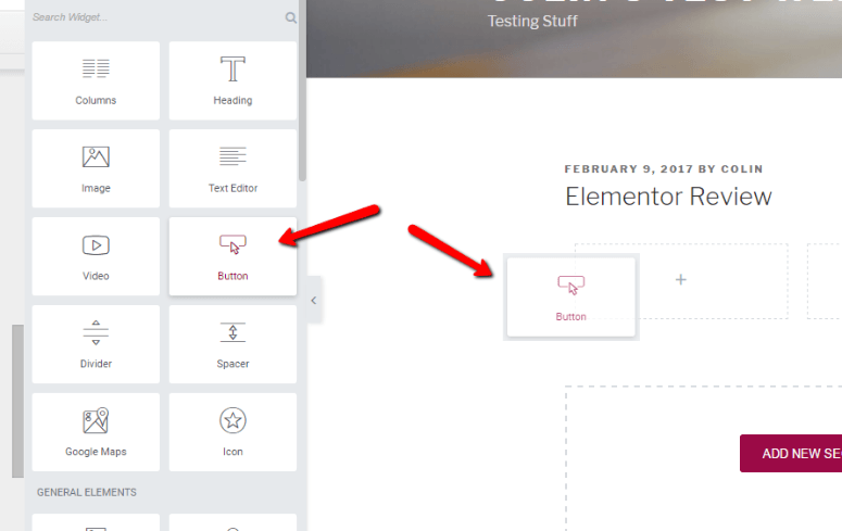
Ok, so you can see I went with a nice three-column layout. Now, to add Elements to that layout, you just need to drag them over from the left-hand side. So to add, say, a button, you just drag it over:
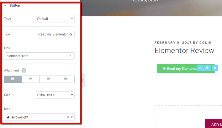
Then, you can configure the basic details for the button like its text, link, alignment, and size in the Content tab:
To edit text, you can now also just click and type on the page. When Elementor first launched, it lacked this feature. But now, editing text is much more convenient because all you do is click and type like you’re working in a Word document.
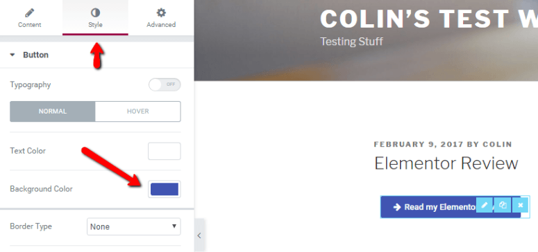
If you hop over to the Style tab, you can configure colors and borders for your button:
And finally, the Advanced tab lets you go in-depth with your button’s positioning. You can add margins, padding, or custom CSS. Then you can even add animation and some other cool settings!
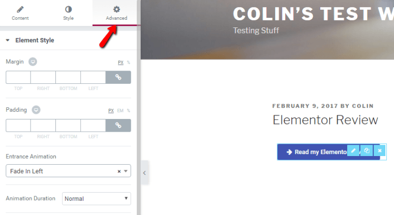
You don’t need to use the Advanced tab. You’re perfectly capable of building pages without it. But if you want the added control, it’s there for you.
Resizing Columns for Better Page Layouts
Ok, so I added a few more elements to go alongside my button:
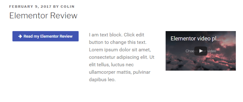
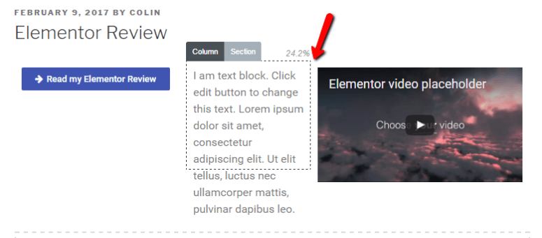
But let’s say you don’t like how small the video is – you want its column to be wider. To do that, all you need to do is hover in the middle and drag its column width over:
Saving Created Layouts as Templates
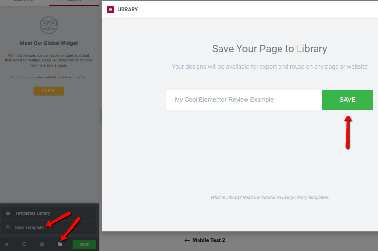
Let’s say you create a layout you’re absolutely in love with. You love it so much that you want to use it on multiple pages. Do you have to re-create it from scratch each time you want to use it? Nope!
You can save any layout as a template:
Which brings me to my next point…
Using Premade Templates to Save Time
Elementor also includes their own premade templates, so you don’t always need to start from a blank canvas. If you opt to go with one of the premade templates (or one of your saved templates), it just takes a few clicks to get started.
Elementor now includes two types of premade templates:
- Pages – these are whole page templates.
- Blocks – these are blocks for specific sections of a page. You can assemble them like Legos to create a complete page, or just use a block here and there.

Then, you can edit and manipulate all of the content just like you could if you’d built the design yourself:
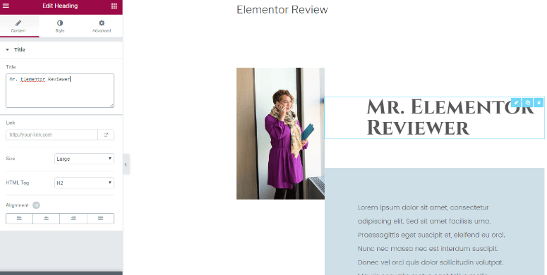
The templates are a great option because they eliminate the need to build a page’s layout. Instead, you’re free to just focus on content.
Previewing How Your Designs Look on Different Devices
Ok, last thing I’m going to show you for now. Because we live in an increasingly mobile-centric world, it’s important that your designs look great on both desktop AND mobile. Makes sense, right?
To help you make sure your designs are responsive, Elementor lets you easily preview how your pages look on:
- Desktop
- Tablet
- Mobile
You just need to click a button in the bottom-left corner and Elementor will show you a live preview:
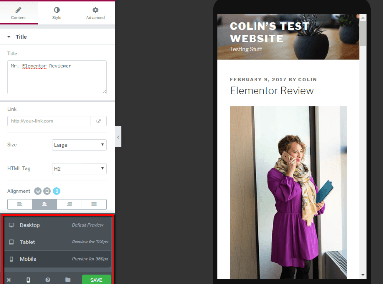
It’s a super convenient and nifty feature.
Elementor Pro Review: Theme Builder, Popups, New Widgets, Plus More
At this point, you should have a pretty good idea of how the core Elementor interface functions.
With Elementor Pro, you’ll use that same interface at a basic level, you just also get access to lots of new ways to apply the interface.
Two of the biggest new features are:
- Theme builder – build your entire theme with Elementor, including your header, footer, blog page, WooCommerce shop, etc.
- Popup builder – create a variety of different popup types using the Elementor interface, complete with targeting and trigger rules.
You also get lots of new widgets. The most notable new widget is a Form widget that you can use to create contact forms, email opt-in forms, etc. There’s also a Slider widget that eliminates the need to use a separate slider plugin.
Finally, you also get some other goodies, like a time-saving global widget feature and the ability to add custom CSS directly to individual widgets, columns, or sections.
Let’s dig in, starting with the two new theme and popup builders.
Elementor Pro Theme Builder
Elementor Theme Builder is pretty simple at a basic level, but the possibilities that it opens are super powerful.
Basically, it lets you apply the same Elementor interface that you saw above to your entire theme, including your:
- Header
- Footer
- Blog archive (the page that lists all of your blog posts)
- Blog single (the design of an individual blog post)
- Any custom post types that you’re using
And if you’re running a WooCommerce store, you’ll be able to build your WooCommerce shop and archive pages using Elementor as well.
In the free version of Elementor, you can only design the content of posts and pages. So Theme Builder basically “unlocks” Elementor to be used elsewhere.
Theoretically, this completely eliminates the need to use a WordPress theme to control how your site looks, though I still recommend choosing a lightweight theme like Astra or GeneratePress for the performance benefits and ability to use global styles.
Here’s how it works:
First, you choose what type of “template” you want to create. A template could be your header, footer…any part of your theme. For example, if you choose Single, you’ll then be able to choose what Post Type to design (e.g. post, page, a custom post type):
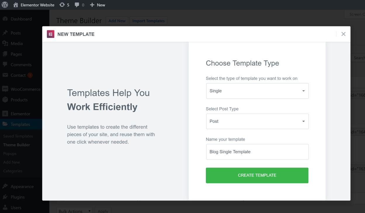
From there, you can either choose from one of Elementor’s pre-made templates, or close the template library to build your own from scratch. For example, you can see that Elementor is offering up lots of templates for a single post design:
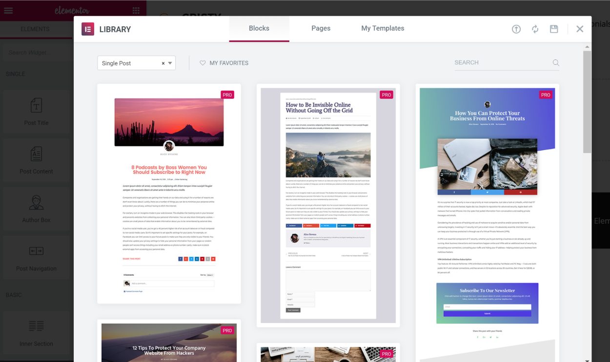
Then, to actually build your design, Elementor gives you a new set of widgets that are specific to the template that you’re creating. For example, if you’re designing a blog single, you’ll get widgets for:
- Post title
- Post content
- Featured image
- Author box
- Etc.
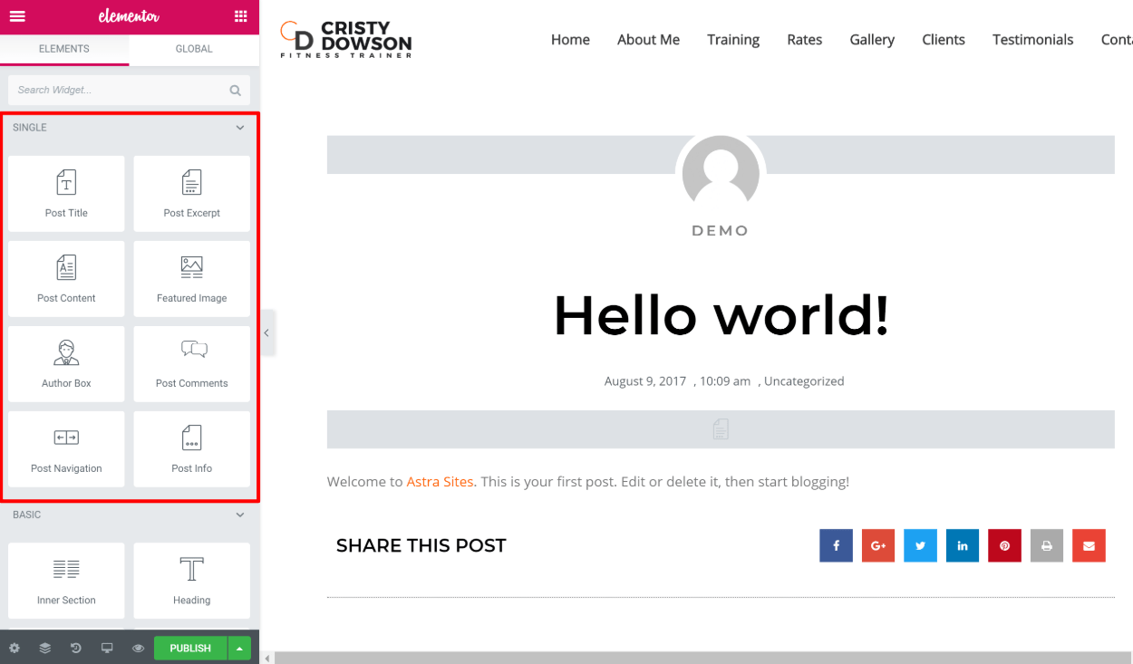
All of these widgets will dynamically pull in information from your WordPress post. For example, the Post Title widget pulls in the information from the Title field in the regular WordPress editor.
Once you’re finished, you click Publish to choose where to use your template. This is another powerful feature because it lets you use different templates in different areas of your site.
The simplest approach is to just use the same template across your entire site. But if you wanted, you could, say, create a special template that’s only used for a certain category of posts:
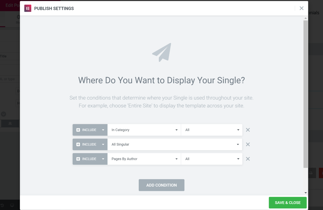
In my opinion, this feature alone justifies the price of Elementor Pro. But there are also some other helpful features…
Elementor Pro Popup Builder
At the time that we’re writing this Elementor review, the Popup Builder functionality is the newest feature addition to Elementor Pro. Beyond being awesome by itself, the addition of such a helpful new feature is also good evidence that the Elementor team is committed to continuously improving Elementor Pro.
Elementor Popup Builder is a lot like the theme builder that you saw above…only for popups (as the name would suggest, right?).
You can use it to design:
- Modal popups
- Notification bars
- Slide-ins
- Etc.
And because you can use any widget inside the popups, you have a lot of flexibility for what you create. You can:
- Create popup forms, like an email opt-in form or a contact form
- Add a popup login/registration feature
- Insert countdown timers
- Promote offers with a generic CTA
- Add age gates
- …a lot more – you can get creative here
As such, you can really use it to replace most popup/opt-in tools. The only area where I’d like to see improvements is the addition of some type of analytics, as right now it’s hard to know what’s happening with your popups (i.e. there are no impression/conversion analytics).
Like the theme builder, you’ll see a list of 100+ pre-made templates when you launch the popup builder.
You can either choose one of these templates or close the template library to build from scratch:
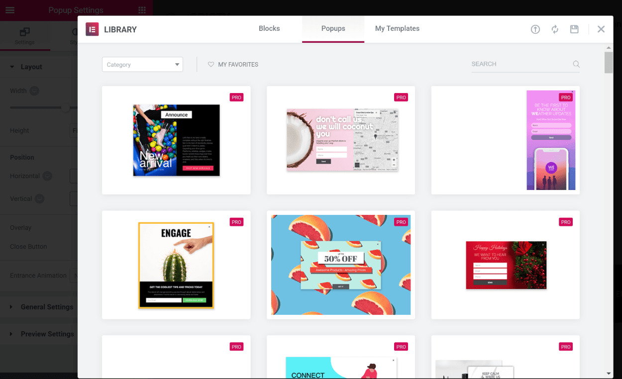
From there, you’ll also get a new Popup Settings area in the sidebar where you can configure stuff like size, alignment, animations, close buttons, etc.:
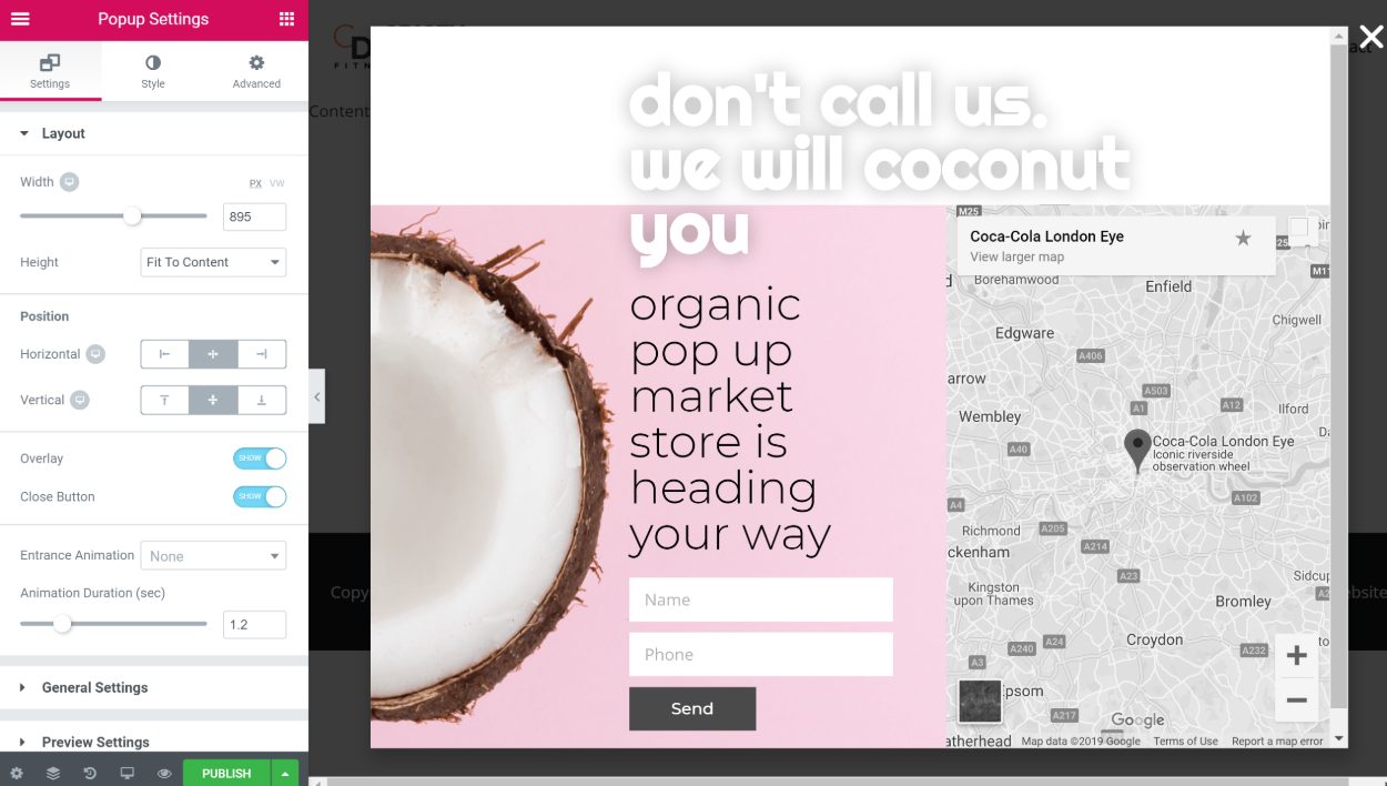
Other than that, you can use all the regular Elementor widgets in your design. That brings me to my next point…
Elementor Pro New Widgets
In addition to the theme builder-specific widgets, Elementor Pro adds 20+ new generic widgets that you can use in any Elementor design:
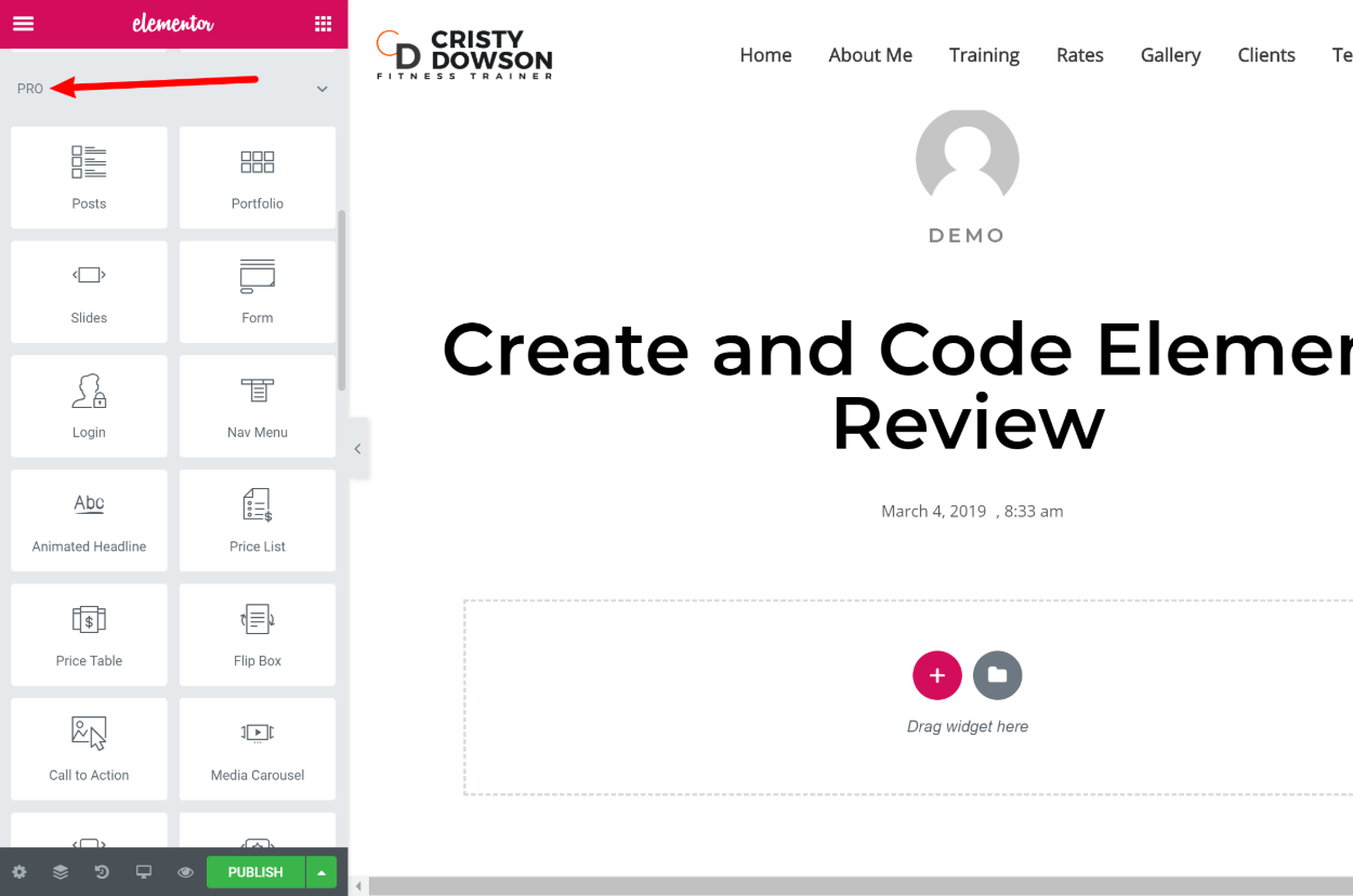
I won’t cover every single new widget, but I do want to highlight some of the most helpful options.
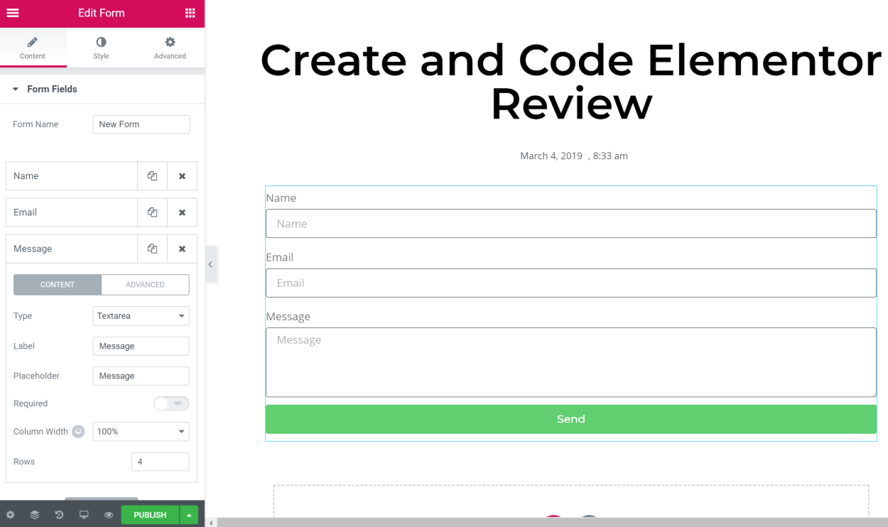
The most powerful new widget is the Form widget. At a basic level, this widget lets you create custom forms with a variety of different field types:
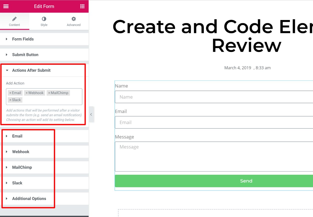
But where the widget gets powerful is the Actions After Submit options. With these options, you can:
- Automatically send notification emails after a form submission
- Add people directly to your favorite email marketing service (like Mailchimp, plus a bunch more)
- Automatically send messages on Slack or Discord
- Connect to Zapier to integrate with any one of the apps there
As you add new actions, they’ll appear at the bottom of the form settings:
And again, you can use this Form widget in the Elementor popup builder, which opens a lot of possibilities.
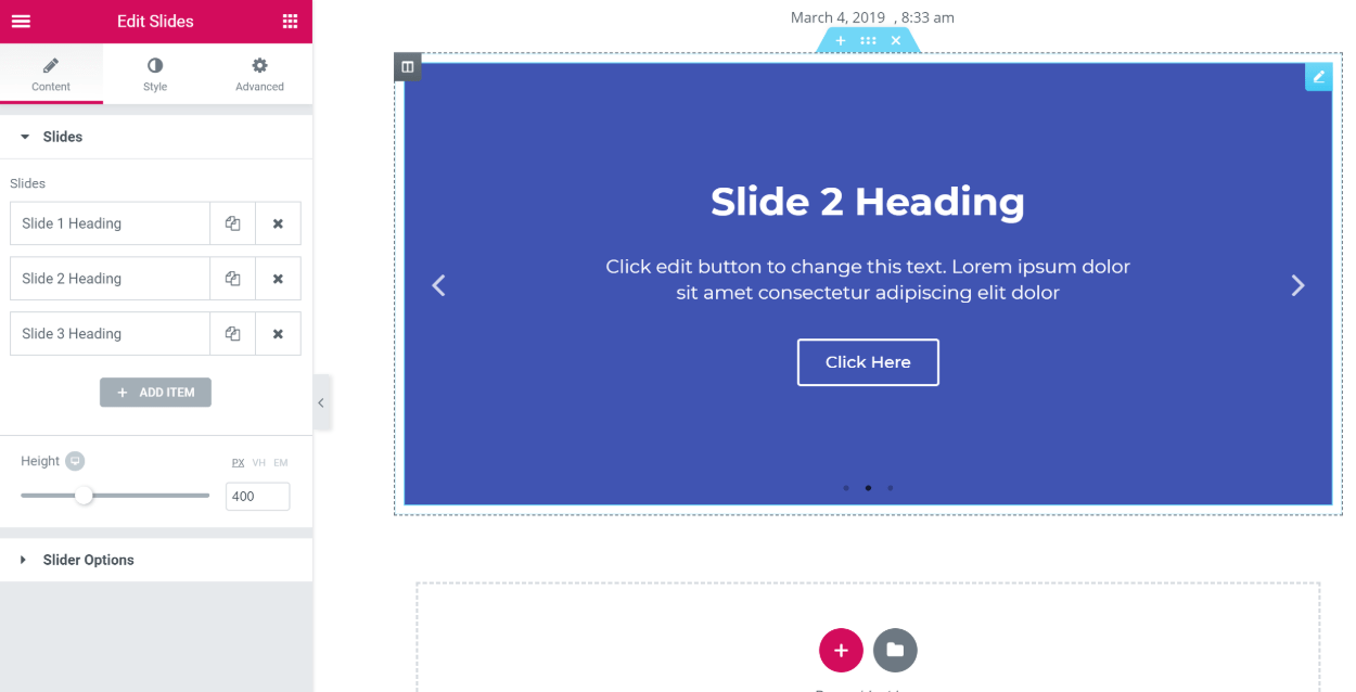
Beyond the Form widget, another helpful addition is the Slides widget, which you can use to eliminate the need for a separate slider plugin.
It lets you create some pretty good-looking sliders, complete with lots of options:
Other helpful widgets include:
- Price table and price list
- Countdown – lets you create an evergreen countdown timer for each visitor
- Login
- Posts and portfolio – these let you dynamically display your blog posts or custom post types
Other New Features In Elementor Pro
At this point, I’ve covered the big new features in Elementor Pro:
- Theme builder
- Popup builder
- New widgets
However, let’s round things out with a quick look at some other helpful features that you get.
First, you get the option to save widgets as global widgets. Global widgets are great if you have a widget that you want to reuse in multiple spots on your site.
With a global widget, if you need to make changes to that widget in the future, you can update it once and have those changes automatically pushed to all instances of the global widget.
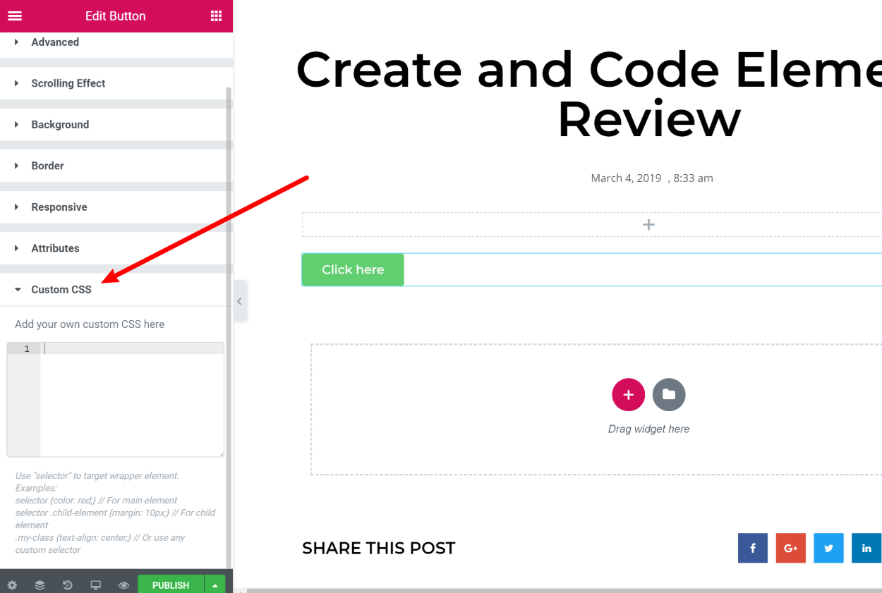
Beyond that, you also get the ability to add custom CSS directly to widgets, columns, or sections, which is a lot faster than using a custom CSS class or ID:
Final Thoughts on Elementor
We originally published the first version of this Elementor review back in March 2017. Since then, Elementor has continued to shoot up in popularity, and the Elementor team has done a great job of pushing out big new features like the theme builder and popup builder.
Based on today’s functionality alone, Elementor is already one of the best WordPress page builders. And with the Elementor team’s commitment to maintaining and enhancing Elementor, we’re confident that it will only get better in the future.
So if you’ve been eyeing Elementor for your WordPress site, we definitely don’t think you’ll go wrong.
You can get a good idea of its functionality from the free version at WordPress.org. Then, if you like what you see, consider upgrading to Elementor Pro for access to all the helpful new features.






The idea that a page builder should be able to create a landing page with no header and footer is ridiculous. That IS – and should remain to be – a function of the theme itself.
And there are a number of themes that do include Page templates for landing pages, or options to hide the header/footer.
That plugin you mention does just that – adds templates you can use with no calls to a header or footer. However, there’s no guarantee it will work with every theme.
I don’t want my page builder to muck around with theme functions. Lets keep some things separate, like WP is designed to do.
Hi Karl,
thanks for sharing your thoughts. While I would agree in an ideal world the theme should control general layout options the fact of the matter is the vast majority of themes don’t come with predefined page templates for landing pages so I think using PageBuilders and plugins for creating landing pages is quite a common use case. We certainly see it a lot. I’ve a ton of clients who create landing pages that aren’t attached to the main site at all and for which they don’t want it to look like their main site look and feel – but they do want it to hang off the main domain like mysite.com/customer-offer-x/
Best,
Colm
Hi Colin
I’ve just started playing with Elementor and like you, I would have liked to add text directly to the page content rather than in the Settings Panel.
I also noticed that although there are no shortcodes, if you delete the plugin, all the page styling is lost.
Hey Keith,
My guess is that Elementor will add inline text editing sooner rather than later 🙂
Colm
“I also noticed that although there are no shortcodes, if you delete the plugin, all the page styling is lost.”
So would it be accurate that you are still being locked in to some degree even if not by shortcodes?
Being a novice, does this actually change your installed themes basic layout, thereby you’re basically not using the installed theme anymore? What about load or speed affects? Does this just replace your theme so to speak? I basically wanted to take a theme I’m using and put sidebars on both sides. How does this affect themes functionality?
Thanks Howard
Can I use elementor for client projects?
Hey Romano – yes you can. The $199 version of Elementor Pro allows it to be used on unlimited client projects. The free version has fewer elements but can also be used in this way.
I use Elementor a lot, in my opinion, the best page builder around at the moment. The only other page builder I use is beaver builder but this is only due to beaver themer the integration with custom post types is excellent. Elementor, however, do plan to release something similar if this happens I think Elementor will become my go-to page builder for every project.