When you set out to create your law firm’s website, I think it’s a fair assessment to say that you did not do it just for fun. No – I’m guessing you’re working on your firm’s website for one key business goal:
Finding more clients.

That’s right. Merely having “a website” should never be the only goal. The goal is to have “a website that gets you more clients”.
But what are the features that take you from a generic law firm website to a client-grabbing, business-boosting website? That’s the key question, and that’s the topic I’m going to cover in this post.
When you’re finished reading this post, you’ll know the 10 features of highly successful law firm websites. Bake these tips into your firm’s website if you want to get more clients from your digital ventures.
1. A Clear Value Proposition
Your value proposition is what immediately catches your visitor’s eye. It’s your biggest headline that sits smack in the middle of the page.
Having a clear value proposition is essential because the average website visitor only spends 10-20 seconds on a page before hitting the back button according to user experience researchers Nielsen Norman Group.
But – Nielsen Norman Group further notes that “pages with a clear value proposition can hold people’s attention for much longer.”
So – provide a value proposition that makes it easy for readers to stick around. For example, look at GJEL Accident Attorneys out of California:

When visitors land on that site, they know exactly what they’re looking at.
2. Contact Methods That Are Easy to Find
Your website’s purpose is primarily to generate leads for potential clients, right? So if you’ve already done the hard work of getting a potential lead onto your site…don’t lose them when it comes time for your visitor to move onto the next step.
To that end, make your contact methods impossible to miss. Better yet – put your contact methods in multiple locations!
Going back to GJEL Accident Attorneys, look how they put their contact information in two prominent locations on their site:

Successful law firm websites eliminate the chance that a visitor leaves without being able to find any contact information.
3. Client Testimonials for Social Proof
Did you know that 88% of consumers trust online reviews just as much as they trust personal recommendations? At least that’s what a 2014 survey from local marketing firm BrightLocal found.
Testimonials make you seem more trustworthy by providing third-party evidence of your quality legal services.
Whenever possible, you should try to use real pictures of your clients in your testimonials. But…clients might naturally be a little shy about having their image displayed on your firm’s website.
In those cases, simple text testimonials are still better than nothing. For example, look how Michels Lew incorporates text-based testimonials into their firm’s site:

4. Plain Language That Skips the Legalese
You passed the Bar exam because you have a mastery of the law…but your clients have probably never even cracked open a legal textbook. And because your website is directed towards those people, not other lawyers, you need to skip the legalese in your website’s copy.
Stick to plain language that a layman has no trouble understanding so that you don’t scare your potential clients off.
5. A Clear Call to Action for What’s Next
Call to actions are an essential ingredient of all websites, not just law firm websites.
Call to actions push your website visitors towards the action you want your them to take. Basically, call to actions answer the question, “what next?” for your visitors.
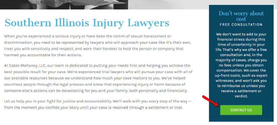
Most of the time, you’ll want your call to action to move your visitors towards contacting you. For example, Cates Mahoney pushes visitors towards their Contact Us page:

6. Detailed Information About Practice Areas
Your value proposition gives your visitors a quick, high-level view of what you offer. It lets them know they’re in the right place and should stick around to learn more.
Now, you use your practice areas to back up your value statement with more information about your firm’s specialties. In some form or another, every successful law firm website includes detailed pages for each practice area.
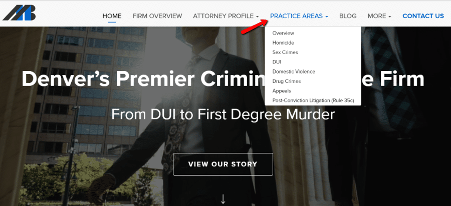
For an example, look how Mulligan Breit includes a drop-down with all of their practice areas, as well as links to even more information:

7. Bios and Background Information on Attorneys
When your potential clients land on your site, they want to know that they’re not going to be working with some faceless corporate law firm. And the best way to convince them of that is to include detailed pages for all of your attorneys, complete with biographies and credentials.
For a great example of how to do this, take a peek at Bick Law’s Team pages:

8. Simple Contact Forms
Internet marketers have known for a long time that every time you increase the length of a form (like a contact form), you decrease the chance that people actually…fill out that form. Additionally, some clients might rightfully be hesitant about submitting certain case information via a contact form.
Resist the urge to collect more information about a client right away. Keep your contact forms short and rely on your consultation to get more information.
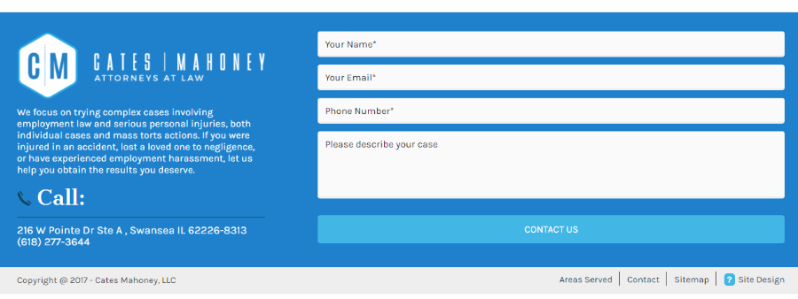
For example, look at Cates Mahoney’s contact form:

Four simple fields, with the case description being completely optional. From browsing successful law firm sites, this four-field approach seems to be the sweet spot.
9. A Blog for Content Marketing
None of the other points on this list matter if potential clients can’t find your website in the first place. And sure, part of getting your website found is nailing the SEO on your homepage and practice pages.
But that’s not the only way you can bring in new leads. A blog allows you to establish your authority, build a sales funnel, and pull in traffic from more keywords and sources. Nowadays, it’s an essential ingredient in your law firm’s website marketing strategy.
For an example, look how Bhatt Law Group puts out a weekly blog post on various traffic topics:

10. Multiple Languages When Necessary
If you’re practicing in an area where you might run into clients who speak a different language than your site’s primary market, it’s essential that you add multilingual capability to your firm’s site.
For example, nowadays Spanish is almost expected on any law firm located in the Southwest of the United States. Look how Michels Law, a Los Angeles firm, includes a prominent “En Espanol” button:

If there’s a decent chance your potential clients might speak a different language, make sure your site is capable of reaching them in that language. As a bonus, translating your site basically doubles your chances of being found in Google’s search results.
Wrapping Things Up
Don’t just throw up a law firm website in a blind attempt to keep up with your peers. When you sit down to build out your firm’s site, put in the time and effort to create a site that truly helps you get more clients.
A little bit of upfront effort from you or your design team will pay dividends down the road.
And if you’re looking to implement these tips, our Judgement WordPress theme can help you quickly get up and running.


Great tips to implement. Thanks for sharing all of this information.