


Fontsquirrel has been around for years and is a popular resource for finding high quality (and mostly free) fonts for projects. Their @font-face generator is a brilliant tool which can convert any font into a web-safe format.
We’re all familiar with Google Fonts but sometimes it can be a bit samey. People do tend to reach for the usual staples for their web projects. Open Sans, Roboto, Source Sans, as the most common examples. Not that there is something especially wrong with this, and you can still see on occasion original implementations – but sometimes it would be nice to see a little more variety. Even if applied just for headings, a sharp, distinctive typeface and give your site a design refresh within minutes.
We’re going to look at some underused fonts from Fontsquirrel’s library that, once converted to a web format, would give any site a typographic boost.
All of the fonts included in this list at the time of writing are not available in the Google font library – if this changes in the meantime, let us know in the comments below.
Licencing
Before we delve into font examples it’s important to discuss licensing. Fontsquirrel is, in my opinion, a bit too relaxed with their tagline above the logo, “100% free for commercial use”. Each font has rather different terms and conditions and it is vital to properly read through the license before using one, contacting the original author if necessary to confirm that it can be used on the web. This is especially important if you will be displaying it on a commercial website for a client. The last thing you need is a legal letter for improper usage.
Also note that in general, commercial fonts are far superior to free alternatives. Professional fonts involve thousands of hours of meticulous work and the result does show. If your project budget allows for it, do support font designers and purchase a license.
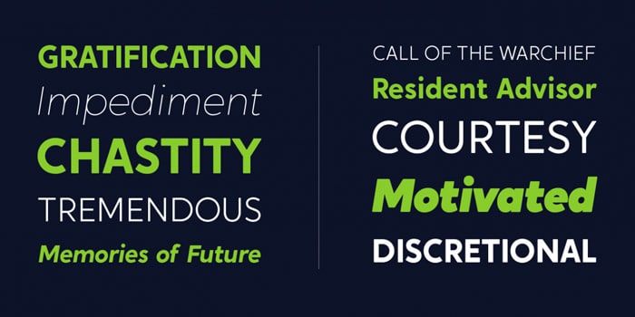
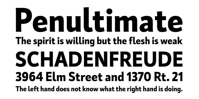
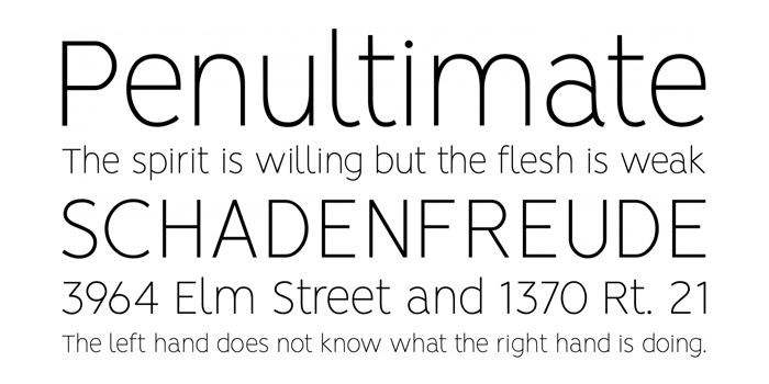
Acherus Grotesque
Designed by Ufuk Aracıoğlu, Acherus Grotesque is a versatile sans serif font that comes in two styles in the free version, regular and italic. It’s a rounded, highly legible typeface that gives a degree of friendliness and approachability to a design.
Download Acherus Grotesque – 2 styles available – Read the license (see Webfont section)
Cassia
This is a dynamic slab serif from the Hoftype foundry with a classic appearance, suitable for a formal look. There is superb attention to detail and it’s widely suitable for the web, with extended language support for more than 40 languages. The only free version weight is the light style, but with careful deployment, it could be a great fit for your site.
Download Cassia – 1 style available – Read the license (see Webfont section)
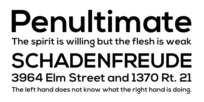
Crossten
A sans serif from Emre Güven, Crossten is a geometric rounded typeface available in light and bold weights. The bold version, in particular, can be used to give a nice ‘chunky’ effect to headings and titles while remaining very readable.
Download Crossten – 2 styles available – Read the license (see Webfont section)
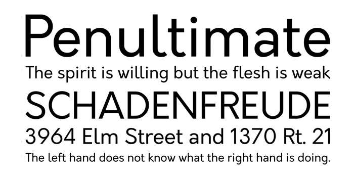
D-Din
The original Din 1451, is, of course, a classic typeface of its era. Commisioned in Germany in 1931, it has been used extensively in road signs and display notices due to its legibility and uncomplicated design. The firm Datto used DIN as primary corporate font and commissioned Monotype to create several alternative styles, for internal use and, thankfully for us, to be open sourced under a SIL OFL v1.1 license as D-Din.
Download D-Din – 8 styles available – Read the license (see Webfont section)
Gilroy
This is stylish, well-rounded sans-serif font designed by Radomir Tinkov. It is similar in some respects to Gill Sans and Avenir so it is by its nature highly readable and works extremely well at large and small sizes. The light and extra bold versions are free of charge but the full version comes with 20 weights.
Download Gilroy – 2 styles available – Read the license (see Webfont section)
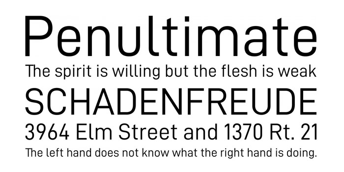
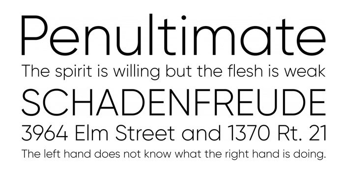
HK Grotesk
A sans serif typeface from Alfredo Pradil and Stefan Peev of the Hanken foundry, HK Grotesk is inspired by the classic grotesques. Their goal was to create a more friendly and distinguishable typeface that is suitable for small text. It comes in 10 different styles and would be an excellent choice for many projects.
Download HK Grotesk – 10 styles available – Read the license (see Webfont section)
Kardinal
Designed by Ani Petrova in 2017, Kardinal is a sans serif humanistic type family. The small serifs are particularly unique, giving the text a distinctive freshness and excellent readability. Two styles are available for free, light and extra bold.
Download Kardinal – 2 styles available – Read the license (see Webfont section)
Nexa
This is a great looking sans-serif available in light and bold versions for free. Nexa Bold was designed by Bulgarian Svetoslav Simov in 2012 and is available through the Fontfabric foundry. The bold version makes for a great heading typeface with wide letters and some distinctive characters such as the lowercase ‘g’.
Download Nexa – 2 styles available – Read the license (see Webfont section)
Orkney
This is a geometric typeface conceptualized and created by the designer Samuel Oakes. His goal in creating the typeface was to have a unique yet functional typeface that can be used for a wide variety of projects on print or screen.
Download Orkney – 4 styles available – Read the license (see Webfont section)
Praktika
Designed by Emil Karl Bertell, Praktika is a sans serif font which consists of distinct widths and weights from extra light to extra bold. It is reminiscent of early 20th-century European grotesque styles, with wider glyphs which work very well for headings.
Download Praktika – 2 styles available – Read the license (see Webfont section)
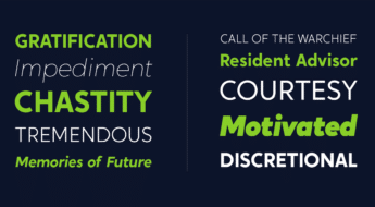
Renner*
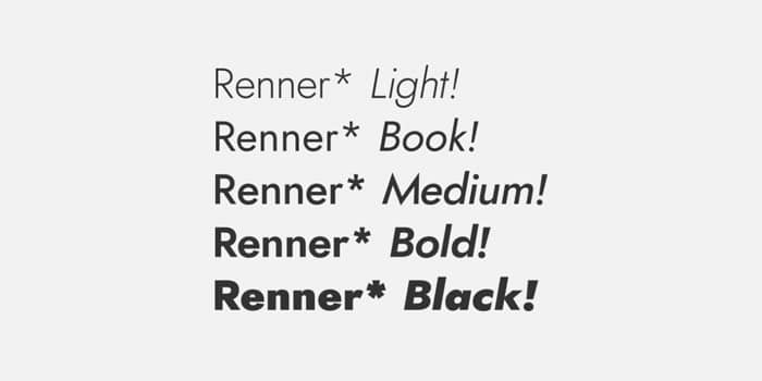
Named after the brilliant designer of Futura, Paul Renner, this is a reimagination of the classic typeface with notable differences. Renner* has 12 styles available so it’s a very versatile option with a range of lighter and bold weights available which makes it a definite flexible option for designers.
Download Renner* – 12 styles available – Read the license (see Webfont section)
Spartan MB
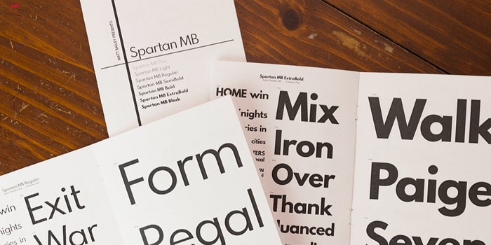
The font Spartan MB is a derivation of the popular League Spartan typeface which contains only one weight. So, due to the OpenType license of the original, graphic designer Matt Bailey (The MB of the title) therefore took the opportunity to delve into font development and created Spartan MB with 7 different weights. It’s reminiscent of the classic Futura and the lighter versions all render extremely well.
Download Spartan MB – 7 styles available – Read the license (see Webfont section)
Sofia Pro
This is an elegant, humanist, rounded sans-serif designed by the Mostardesign Type Foundry, established in 2009 by Olivier Gourvat. It has a warm, approachable feel and is available in a light version for free.
Download Sofia Pro – 1 style available – Read the license (see Webfont section)
Tecnico
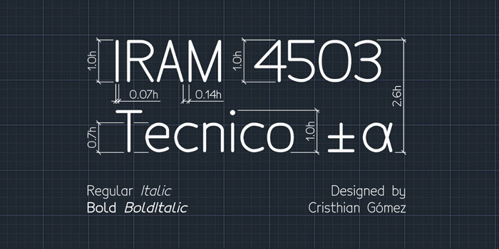
Designed by an Argentinian designer called Cristhian Gómez, Technico represents standardized writing used in architectural and engineering plans. Befitting that background, the glyphs are clear and easy to read. It is available under the SIL Open Font License and comes in light and regular styles, both with separate italic versions.
Download Tecnico – 4 styles available – Read the license (see Webfont section)
Vision
Created by a Spanish designer, Daniel Iglesias, Vision is a type family of 12 fonts so you have a wide selection of weights and styles to choose from. Influenced by the Russian architect and graphic designer El Lissitzky, Vision is a geometric sans-serif which looks both clean and modern and would be a solid choice for a project.
Download Vision – 12 styles available – Read the license (see Webfont section)


Hey Simon,
I’m looking for a nice Grotesk that can be embedded into a theme which is not an easy task as you probably know 🙂
Your article helped, thanks!
Ondrej